
Visualizing Case Outcomes by Age
Exploring CDC's "Master" Case line file to gain perspective and proportionality


Since the beginning of the pandemic, news reports have been obsessed with case counts. We have known since 2020 that PCR detections are not one in the same as clinically diagnosed disease1. The reality of asymptomatic cases and detection of dead viral RNA2 was clear from the start but it never made its way into policy guidance, as every positive test was treated the same.
It seems that early in the pandemic, the argument was that out of an abundance of caution, the value in assessing every possible infection was high in that it could possible help with containment, even if it were a mild case. As testing ramped up, so did detection, thus fueling the erroneous conclusion 3 that the virus was just then surging. The rationale behind mass, asymptomatic testing quickly evaporated in March 2020 when we it became clear that SARS-COV2 was widespread and containment was no longer possible. The futility of this premise is explained thoroughly in Dr. Jay Bhattacharya’s article here.4
After I learned this in summer 2020, (where it even got mainstream press), I expected there to be a shift back towards traditional medical definition of illness. But that’s not what happened, and to this day we’re still somehow ascribing too much significance to PCR results, that this paper in JAMA5 explained...
“Real-time PCR is not a viral culture and does not allow determination of whether the virus is viable and transmissible.”
Knowing when you can transmit or infect others was/is pretty valuable. Knowing a clinical diagnoses so a healthcare provider can treat is valuable. Knowing exactly how many “cases” that are happening at any given moment outside of a healthcare setting? How valuable is it at this point?
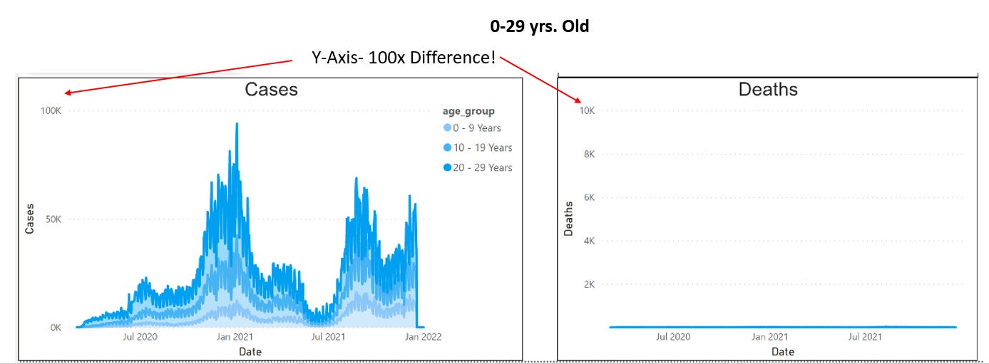
Nonetheless, our obsession with cases and testing allows us to truly visualize what Dr Bhattacharya was describing when he said “older people were 1000 times more likely to die of covid-19 than younger people”6
The CDC Case Surveillance File7 is an incredible data source because it actually aggregates US wide cases, de-identified, and shows us the actual outcomes per each of those same cases. It also allows us to group by age, allowing us to see how many of these cases actually resulted in hospitalization or death. Take a look at Ages 0-29 Cases on the left, and deaths on the left. I call out the fact that I have zoomed in on the Y-axis by a factor of 100, and the deaths are barely perceivable. (For paid subscribers, you can adjust the Y axis, select age groups, and make your own comparison charts).
In Contrast, take a look at the 80+ yr old. In this side by side- the Y axis is exactly the same. It’s clear to see the fact that a “Case” is absolutely serious and meaningful in an elderly person.

Age stratification of the risks of Covid have been conspicuously absent to our Covid policies, and the ever-present surging PCR detection charts have conditioned many to see something that isn’t there: an ever present, unique, and extraordinary risk to their children. We need to look deeper and pursue appropriate proportionality and perspective.
Access the interactive dashboard below to make your own charts and comparisons by age, and URL links to academic sources cited in the post.
