Seeing Red: The New York Times' "Red Covid" Series
Elite Media's Political Reductionism Distorts Reality and is Bad for Health
Because there are no possible ways to analyze, categorize, parse, or dissect population data other than by “Share of Trump votes,” there must not be *any* other possible explanation for anything other than that red counties = bad (high Covid deaths!), blue counties = good (not as high Covid deaths!).
Of course I am being facetious. The entire proposition is just silly. The concept of innate differences in populations is a well established consideration for those who study population health. One might think that our nations most prestigious newspaper might require their top writer to consult with population health experts or even an actuarial scientist in order to obtain a more informed perspective and give the data more rigorous analysis.
Let’s take a look at the highlights of David Leonhardt’s “Red Covid” series.
September 27, 2021
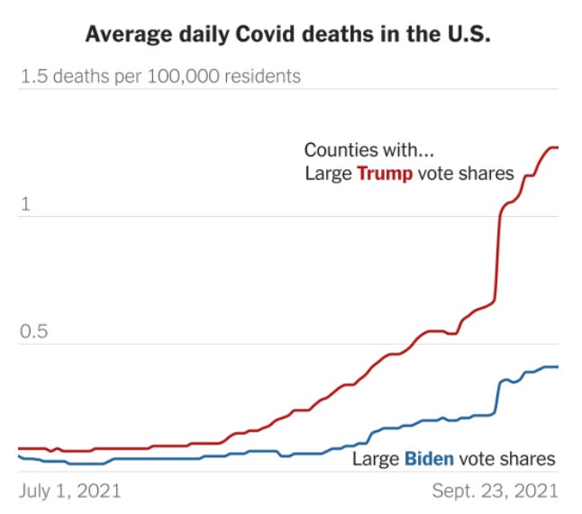
“Red Covid: Covid’s partisan pattern is growing more extreme.”
(Please note the Y-axis on this chart)
“What distinguishes the U.S. is a conservative party — the Republican Party — that has grown hostile to science and empirical evidence in recent decades. A conservative media complex, including Fox News, Sinclair Broadcast Group and various online outlets, echoes and amplifies this hostility. Trump took the conspiratorial thinking to a new level, but he did not create it.”
“Democratic politicians have been imploring all Americans to get vaccinated and many Republican politicians have not.”
November 8, 2021
U.S. Covid Deaths Get Even Redder: U.S. Covid Deaths Get Even Redder
“The brief version: The gap in Covid’s death toll between red and blue America has grown faster over the past month than at any previous point.
In October, 25 out of every 100,000 residents of heavily Trump counties died from Covid, more than three times higher than the rate in heavily Biden counties (7.8 per 100,000).”
February 18, 2022
“Red Covid, an Update: The partisan gap in Covid deaths is still growing, but more slowly.”
“As the chart makes clear, the toll has been even worse in counties where Trump won by a landslide than in counties that he won narrowly.
“This phenomenon is an example of how the country’s political polarization has warped people’s thinking, even when their personal safety is at stake. It is a tragedy — and a preventable one, too.”
Before getting into the specifics about these over-simplifications, I would like to make clear that I believe that Leonhardt’s statements above reflect a genuine belief. He truly believes that political preference is the causal explanation for Covid mortality. Not health status, age, weight, comorbidities. Just one thing: personal political preference.
To be clear, he believes that the underlying explanation for higher Covid-19 mortality in red counties is actually the lower vaccination rates in red counties. So by extension, this is explained by political preference.
What I hope to lay out below is a more complete picture of what is going on when we subdivide the county level data into the categorizations that Leonhardt chose: ‘Share of Trump Vote within county’ (0-30%, 31-45%, 46-55%, 56-70%, and 70%+). Using historical county level mortality data, I will attempt to answer the following questions:
How do Covid mortality trends compare with historical trends when categorizing by political preference?
Does Covid-19 mortality correlate with all cause mortality?
Did 2021 see a major, unprecedented divergence in overall mortality between ‘red’ and ‘blue’ counties?
There could be additional analysis done to see whether or not vaccination rates are correlated with overall mortality (as opposed to just Covid-19) over the long term, However with the definition of “fully vaccinated” or “up to date” being a moving target, I have chosen not to compare deaths by vaccination rate by county for now (many others have already undertaken that task!). To be clear, I believe that for those who are at risk, the vaccines have been shown to reduce the risk of the disease to those individuals. The goal of this analysis is to look deeper into these political subdivisions that the New York Times’ insists is an unquestionable explanation for Covid-19 mortality otherwise known as “Red Covid.”
Keep reading with a 7-day free trial
Subscribe to Relevant Data to keep reading this post and get 7 days of free access to the full post archives.


