CDC's claim about "Covid Myocarditis" come up short in real world
Population Level Hospital Data Does Not Corroborate CDC MMWR
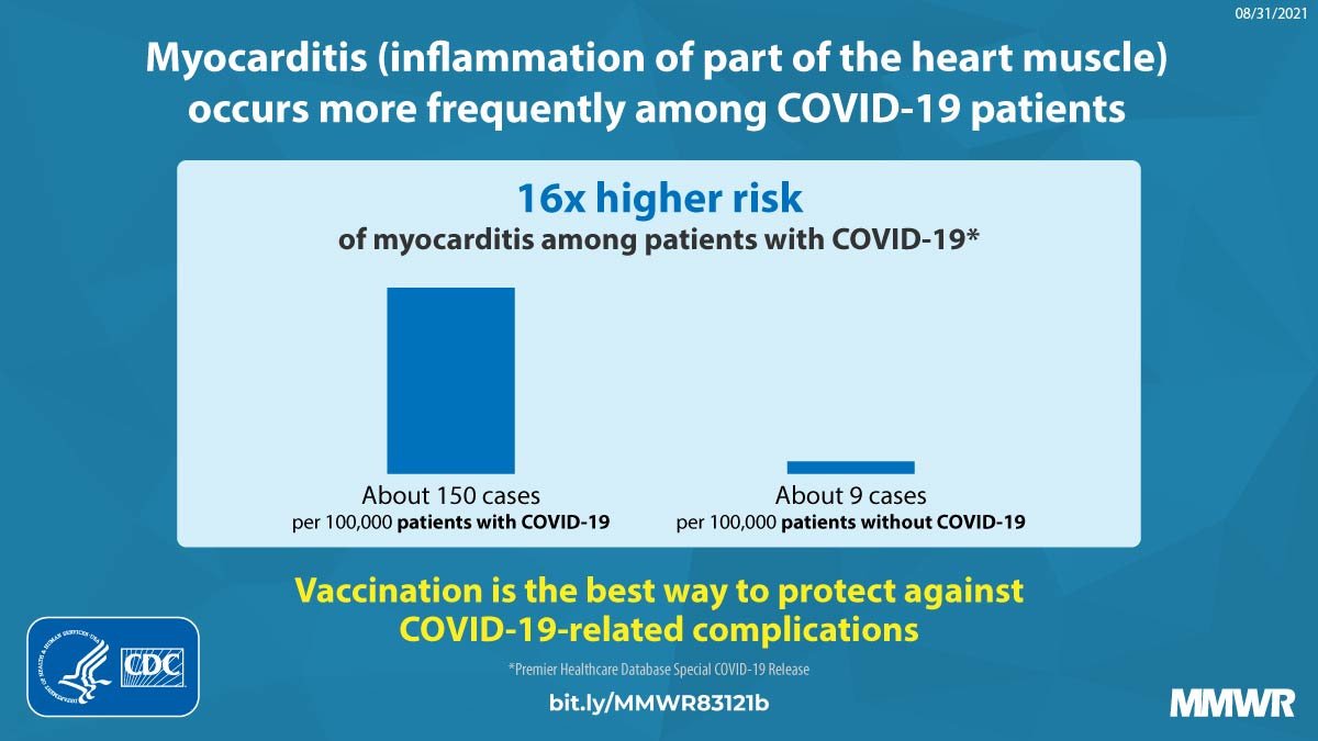
The below are charts and links to CDC’s claims about “Covid myocarditis” that they made throughout the last couple years, as post-mRNA vaccine induced Myocarditis was being established as a known safety signal and particular risk to young men. See the sensational charts with links below:
CDC Bad Chart #1
https://www.cdc.gov/mmwr/volumes/70/wr/mm7035e5.htm?s_cid=mm7035e5_w
The previous chart’s flaw: comparing cases of people either hospitalized for or with Myocarditis AND Covid (which might have been incidental), to patients in the hospital for any reason without Covid. What this chart answers is “what is the prevalence of myocarditis within already hospitalized patients with/for Covid, vs. those without? This ignores a couple key facts. 1) Inevitably everyone is going to have had Covid. 2) The actual number of infections for Covid in the denominator- rather than already hospitalized people. This cannot answer a question about whether or not Covid increases the risk of Myocarditis because we need to compare it to background rates of Myocarditis in the population, and then compare to make sure we’re not picking up incidental Myocarditis.
CDC Bad Chart # 2
https://www.cdc.gov/mmwr/volumes/71/wr/mm7114e1.htm
Instead of spending the time rebutting this previous study, I’ll point you to the brilliant work of Cardiologist Anish Koka, who deals with all of the CDC claims thoroughly here.
So if these claims about “Covid myocarditis” being orders of magnitude more prevalent than post-vax, we should obviously see this show up in population level incidence, right? Surely in 2020, when there was no vaccine, there must have been a big uptick.
Keep reading with a 7-day free trial
Subscribe to Relevant Data to keep reading this post and get 7 days of free access to the full post archives.


