
Bringing Honest Data to Used Car Research
A side project for the same kind of reader — one who wants the numbers without the spin. Introducing vehiclereliability.com

About 2½ years ago I was in the market for a used vehicle — a position most of us land in every few years. I’m a sucker for quality and I never buy brand new, so I’m unsurprisingly obsessed with reliability research. During that process, an idea hit me: what if we approached vehicle quality the same way we approach population health? Could we build a population-wide analysis that compares relative failure rates across models? How much more often does Model X break down than Model Y — and when it does, how bad is it?
For the last two years, that’s what I’ve been building. The result is a platform anyone can use:
If you’re data-informed (or data-obsessed), and either shopping for a used vehicle or know someone who is, take a look.
Don’t worry — I won’t be converting this newsletter into a marketing arm for the platform. But if you’re the type of person who reads my work, you might just find it useful.
Buying a used car is one of the biggest financial bets most of us make, and it’s usually made with surprisingly little hard data. This dashboard exists to fix that. Here’s how to read each section.
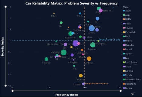
The Reliability Matrix
The Matrix plots our two core metrics — frequency (how often a vehicle breaks down) and severity (how bad it is when it does) — against the class average. Each vehicle is only compared to peers in its own class and model year, so you’re seeing apples to apples.
The four quadrants tell you the risk profile at a glance:
Bottom Left — Low frequency, low severity. Rarely breaks. When it does, it’s minor. The most reliable vehicles in the class for that year.
Top Left — Low frequency, high severity. Rarely breaks, but when it does, expect something serious — transmission, engine, drivetrain.
Bottom Right — High frequency, low severity. In the shop often, but the problems are manageable and cheap.
Top Right — High frequency, high severity. The worst of both worlds. These vehicles break the most and cost the most to fix.
Use this to quickly rule in or rule out a model before digging deeper.
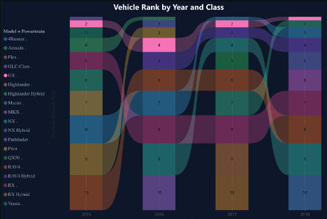
Vehicle Rank by Class
Track how a model’s ranking has held up year over year. Consistency matters here — the less a vehicle “shuffles” up and down the rankings, the more confident you can be that its quality is structural rather than accidental. A vehicle that lands in the top 3 of its class five years running is telling you something different than one that bounces between 2nd and 12th.
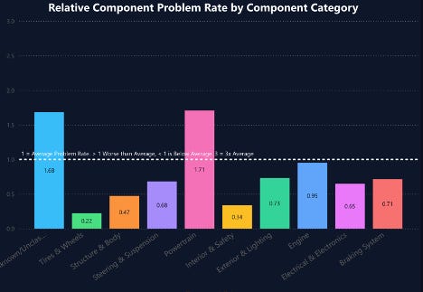
Component Breakdown
This chart breaks reliability into 10 major component categories — engine, transmission, electrical, brakes, suspension, and so on — and shows whether each one fails more, less, or about the same as the class average. Bars below the dotted line are good: those components are higher quality than peers. Bars above it are where the trouble lives.
Use this to figure out what kind of problems you’d actually be inheriting.
Model Year Comparison
Even the most reliable brands have problem years — a redesign that didn’t land, a flawed supplier, a recall. And the hybrid version of a model can have a meaningfully different reliability profile than the gas version. This chart helps you tease both apart.
The score combines the frequency and severity indices. A combined score below 2 means both indices came in under the class average (under 1 each) — a higher-than-average quality year. Anything well above 2 is a signal to look closer before committing to that model year.
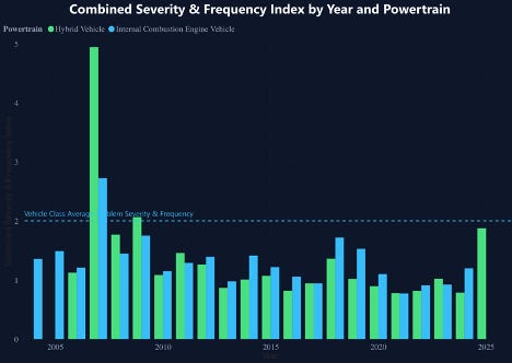
Use this when you’re deciding between two years or two powertrains of the same model.
For details on how we calculate these metrics, see our Methodology FAQ.